

Lilly medical education projects were vast, and I was lead creator for all projects over the past 3 years. Most projects for Lilly had fast turn arounds and some projects required on the fly updates as messaging could change from day one of a conference to day two. Each brand had their own specific projects and when a group of clients would see something new on another brand, they usually wanted a version for themselves. The creative drove business growth and led to triple the scope of our creative portfolio.
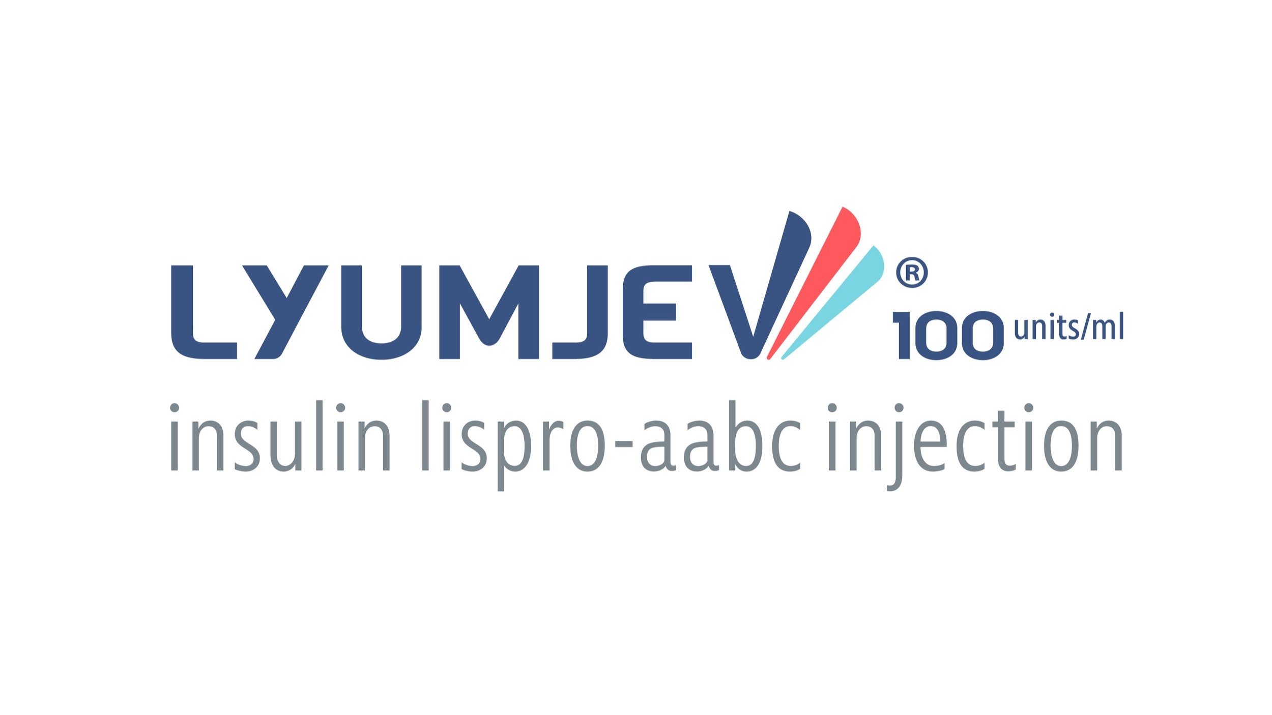
The first of Lilly’s diabetes medications, Lyumjev, is the most recent product I worked on. Lilly came to us looking for branding and clear way to present their latest medication. With a two-page brand book and while working alongside other creative teams, we utilized the palette to differentiate information, and the logo’s feather shape throughout our pieces. As additional imagery became available the brand and projects were brought to life.


The next brand is Baqsimi which was a nasal spray for low blood sugar. As an established brand we sought to push the client and expand the brand possibilities through multiple media projects. As a result, texture and color adorn projects that were once white pages with a logo and image in a square.


Humulin R U-500 is an insulin medication that was in need of branding and asset help. Most of the imagery needed updating and corresponding graphics and icons needed to be created for U-500. Using overlapping and transparent polygons the branding shapes were utilized in a more effective way with the new imagery. The new assets also helped make the information clearer.


Trulicity was both the most fun and frustrating Lilly brand I have worked on. We had multiple conference topics that all needed their own Trulicity branding while also having cohesion amongst one another. Our Long Term Care work uses slightly different assets and images than other topics. Similar topics alternate colors and imagery. In building out the brand styles we also created conference materials and registration websites.


Any creative who has worked on Lilly knows there is never too much Lilly Red, especially in their own branded pieces. Whether it is a public facing or internal project the palette is red first and utilizing texture we created projects agreeable to the client. When the opportunity came to redesign Lilly branding for the new year, I decided red would become an accent and not the default. This expanded the branding to use more of its palette and make Lilly Red for the most important information and the clients loved it. Now, wherever you see Lilly Red it serves a purpose and catches the attention of the viewer.

